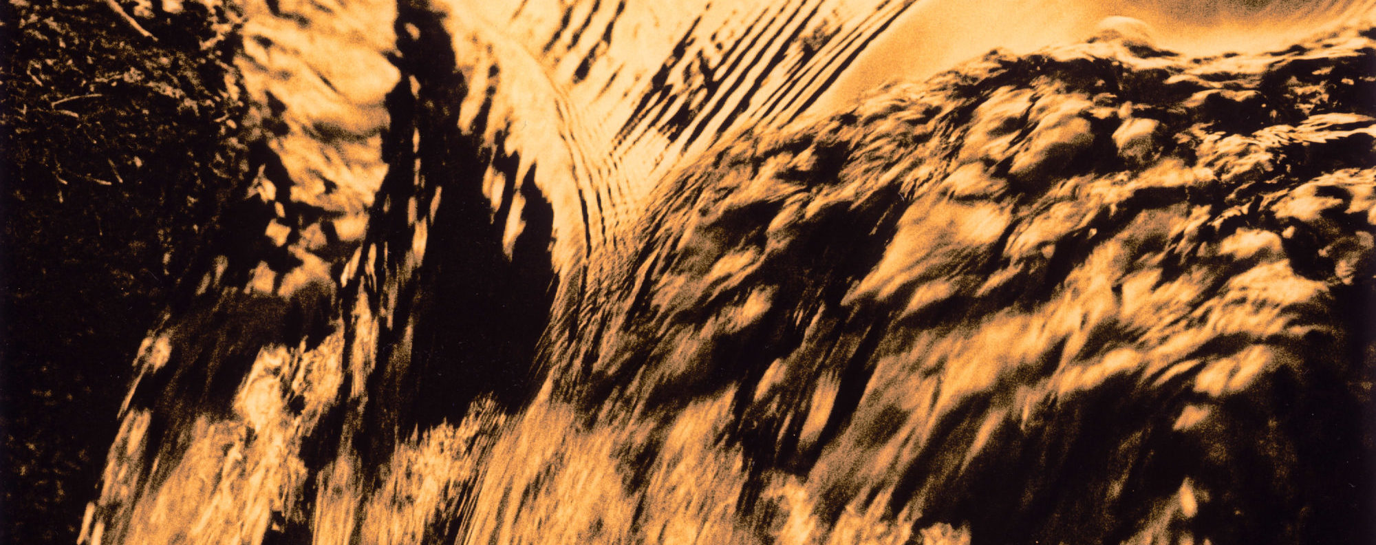
Reflecting Smith’s training, he had studied at the prestigious Architectural Association in London – the couple frequently tackled architectural subjects but typically tended to focus on the offbeat such as follies and the postman Ferdinand Cheval’s grotesquely surreal self-built Palais Ideal at Hauterives. Above all The Saturday Book offered the perfect vehicle for Smith to express his relish for the incongruous and his facility for discerning the extraordinary in the seemingly ordinary.
Besides the stellar cast of its contributors, a number of constants can be discerned amidst this ‘mixty-maxty’, as a contemporary reviewer dubbed the journal. First, the editors’ emphasis on the purely escapist nature of their enterprise was somewhat disingenuous as the The Saturday Book equally displayed ‘an affectionate concern with the unfashionable and the neglected‘. Chief among these were its advocacy of folk art and more particularly its espousal of Victorian culture at a time when Britain’s nineteenth-century legacy was almost universally despised. Smith and Cook were passionate proponents of both. Encouraged by his friend Enid Marx, herself one of the foremost authorities on folk art, Smith had at the outset of his photographic career in the 1930s concentrated primarily on the varied manifestations of popular culture-the pub, music hall and especially the circus and fairground. This choice of subject matter was in part inspired by his admiration for the work of the great French photographer Eugene Atget (1857-1927), but whereas Atget’s photographs, taken on a large format camera, were elegiac in tone, Smith’s more spontaneous images, created with a hand-held Leica, were celebrations of a still vibrant culture. When some of these photographs were published for the first time in The Saturday Book 11 (197I) they came as a revelation to those who only knew Smith’s photography through his later painstakingly crafted evocations of place. ‘Once despised as crude and uncultivated, its vivid and eloquent spontaneity now appeals’ declared Smith and Cook of popular art in a joint article written for The Saturday Book 8 (1948) before going on to explore in subsequent issues such subjects as ships’ figureheads, Christmas fancies and, most engagingly, seaside artefacts. For Smith and Cook popular art was a living tradition that held important lessons for contemporary designers not least as a mellowing antidote to what they perceived as the sterile functionalism of Modernism.
Their admiration for the exuberance of Victorian art and architecture was similarly grounded and mirrored Russell’s own ardent appreciation which had led him to discover a cache of Victorian photographs which he used to illustrate The Saturday Book 3 (1943). In 947, in a move that signalled a shift away from his pre-war social reportage photography towards a greater engagement with architecture, Smith was commissioned by Art and Technics to write and illustrate a book on the Gothic Revival.
The photographs display his deep love of his subject matter, but, allowing his enthusiasm to get the better of him, Smith produced a text that greatly exceeded the stipulated length and consequently remained unpublished . The Saturday Book thereupon became the chief means by which he and Cook proselytised Victorian achievements with articles about pictures before the cinematograph. Additionally, in ‘The Saturday Book 18 published in 1958, a year after the Victorian Society had been established, Smith illustrated an article on British architecture by fellow enthusiast and one of the Society’s founders, John Betjeman, which evinced a distinct bias towards Victorian buildings.
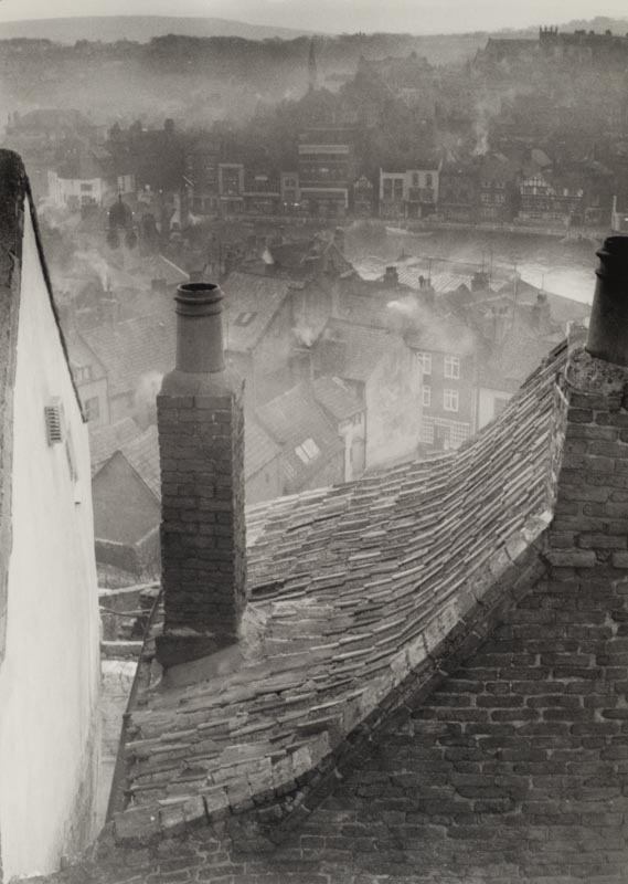
A second consistent refrain of The Saturday Book was its commitment to the provision of high-quality illustrations together with an appreciative recognition that these ‘need not all be subservient to the text, mere illustrations to it: some could be articles, as it were, in their own right, telling a story visually.’ This was a concept brilliantly exploited by Smith and Cook who did much to rescue the magazine from its unpromising beginning. Text-heavy and illustrated with wood-engravings, the inaugural issue was not well received and as Hadfield later admitted sales only picked up once a scrapbook type of layout had been introduced in issue 3 and, crucially, many more pictures, including a generous number in colour, accommodated in issue 4 ( 1944). Among these were the illustrations to Smith’s debut article, ‘The Domestic Shell’, which Hadfield reckoned proclaimed Smith as ‘a most accomplished and original photographer of buildings’. In truth the photographs are competent but uninspiring. Of more importance for the future was the way in which, within the confines of a rather conventional page layout, Smith integrated text and illustrations so that both together advanced his argument that ‘simplicity in good material is the only means to grace and dignity in domestic architecture’ In later issues Smith and Cook grew more inventive encouraged by the magazine’s other mainstay, its coruscatingly imaginative designer, Laurence Scarfe, who had recommended Smith to Russell. A good example can be found in The Saturday Book 9 (1949) with Smith and Cook’s piece on shops entitled ‘The One in the Window’ where Smith’s rather surreal black and white photographs, taken a decade earlier and much inspired by Atget, are adroitly mixed with colour reproductions of postcards and other artefacts including a toy theatre set for Aladdin made by Benjamm Pollock Ltd. It was this intoxicating blend of photographs of actual places and objets d’art combined with reproductions of paintings, prints and engravings, many in colour, that rendered The Saturday Book so visually seductive. It also testifies both to Smith and Cook’s discerning eye and their ability to make telling connections between widely disparate images and from them construct a coherent narrative. Both were accomplished artists and there is a collage quality to their pictorial essays which proved so popular that a special collection of them published in 1955 sold out almost immediately.
As Russell recalled, the couple’s involvement went beyond writing and illustration: ‘both prodigies, they were an editor’s dream. They did everything themselves, layout included, you just sent the words to the printers and the pictures to the blockmakers.’ This experience with The Saturday Book was to prove invaluable in Smith’s later dealings with publishers. Not only did it give him a thorough grounding in the rudiments of page layout, it also gave him an insight into how best to render his photographs suitable for reproduction: ‘the photographer should not fill the frame, but should allow a considerable latitude for trim, both for “bleeds” and for any difficulties of fitting a halftone reproduction to a layout.’ These considerations underline the fact that the notion of an ‘original’, definitive print in Smith’s archive has little meaning as images pulled from the same negative frequently recur in different versions in different contexts. In addition few of Smith’s negatives can be printed straight and there are often significant variations in the prints he himself produced reflecting the uses to which they were to be put. But like his accomplished forebear Frederick Evans, to whose imagery his photography bears certain affinities, Smith was not enamoured of halftone, preferring instead the much more subtle photogravure which, making an exception to its usual policy, The Saturday Book 3 had used to illustrate an article on Evans. Photogravure was the process employed to stunning effect in Smith’s classic works for Thames and Hudson such as The Wonders of Italy (196 5) with plates by the leading specialist firm, Braun et Cie, and he was bitterly disappointed when it became too costly to use in the late 1960s. When Thomas Nelson came to publish his and Cook’s The English House through Seven Centuries in 1968, Smith revealed the publishing house was experimenting with duotone, ‘in which a double printing attempts to get over the rather depressing greyness of Photolitho. The proofs they showed me had not succeeded in this … I would of course like to insist that the book was done in gravure by one of the first-rate continental firms- this is the only way to get the best out of the pictures and to match up to my prints. But I am too reasonable to be a “primo-signore” … I did a book for Weidenfeld (Great Interiors) which was printed photolitho and the results in my opinion are dismal (though the colour plates in the book are the best I have had, which is a consolation).’ This quotation vividly emphasises the care and attention Smith devoted to the way in which his photographs were reproduced. Photographic historians should take note.