Printing the Negative
Once I have the negative image prepared, I save it as a Photoshop file with all layers intact in case I need to go back and make further adjustments. Before printing, I flatten the image. Being careful not to save it again over the top of the file already saved (been there, done that), I save this flattened image as a TIFF file with a distinct name that identifies it as a digital negative printing file.
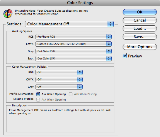
I’ve not mentioned colour management yet. Colour profiles are unnecessary in this workflow as we are dealing with greyscale images. In fact, they can really get in the way of accurate reproduction. When you import your TIFF file at the start of this process, make sure that colour management is turned off. You can do this by loading a pre-saved Color Settings File (.csf) in Photoshop that has the kind of settings shown here.

Open the Photoshop print dialogue box, ⌘P on a Mac, and select your Printer in the drop-down at the top of the panel. These instructions are specific to the Epson Stylus Pro 3800, which is recognised to be one of the best printers for producing digital negatives, but good results can be obtained with most of Epson semi-professional range, from the 2880 upwards. The key factor is the use of the K3 pigment ink set. I always centre the image and scale it to fit. Make sure that ‘Printer Manages Colours’ is selected in the drop-down on the right. DB recommends that you select ‘No Colour Management’ but I found that I was unable to print at all with that setting. Everything appeared to work fine, but the file was not sent to the printer.
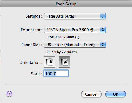
Make sure that you enter the ‘Page Setup’ dialogue and also select your printer there in the ‘Format For’ drop-down. Then make sure the ‘Paper Size’ is set correctly. Pictorico film is available in US letter (8.5 x 11 inches) and 11 x 17 inch sheets. Make sure you choose the right size and also that you select from the sub-menu for the chosen size the (Manual-Front) option. More on this later.
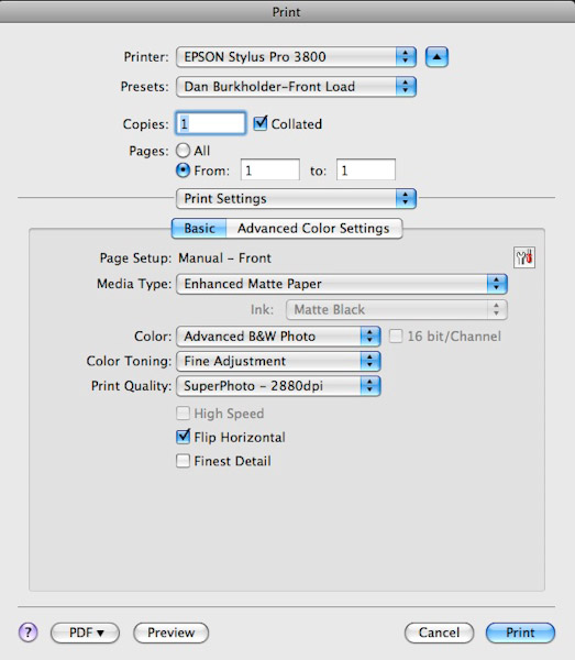
Once you hit the ‘Print’ button you are taken to the printer dialogue screen. This is where quite a lot of work needs to be done. One day, we can only hope that the hardware and software manufacturers will work together to simplify the printing dialogue and present it in one interface window – and enable every aspect of it to be saved so that this tortuous procedure can be simplified.
Some workers (including DB) apply a colour tone to the black, via these printer settings, to increase the UV absorption factor of the ink. This is is because the majority of those workflows I have seen are concerned with making digital negatives for use with contact printing by UV light (platinum/palladium, salt prints, etc). If you are making a negative for straight silver-gelatin printing, or lith printing as I am, then this additional colour tone is not required – in fact, it can be detrimental to the print tonality if variable contrast papers are used, as I discovered and will mention further.
With ‘Print Settings’ selected, in the ‘Basic’ tab, choose ‘Enhanced Matt Paper’ for Media Type. Epson printers only list media types that Epson themselves produce. They do not produce a transparency film and so we tell the printer that we are using matt paper. This is to force the use of the Matte Black ink, which produces a higher density than Photo Black.
Next select ‘Advanced B&W Photo’ for Color; ‘Fine Adjustment’ for Color Toning; and ‘SuperPhoto-2880dpi’ for Print Quality. Then check the ‘Flip Horizontal’ box. This ensures that the image is printed reversed on the film so that it may be printed in contact with the light sensitive paper at the next stage, thereby creating a positive in the correct orientation. You could of course flip it in Photoshop and print without the check-box selected, but it’s there so we may as well make use of it and keep our image looking correct on screen. Finally, leave the ‘Finest Detail’ box unchecked, as no advantage is gained by enabling this.
Note that the ‘Presets’ box in my examples shows something called ‘Dan Burkholder-Front Load’, this is a preset that I created based on the front loading recommendations of DB. It populates all of the boxes with the settings described here. More of that later.
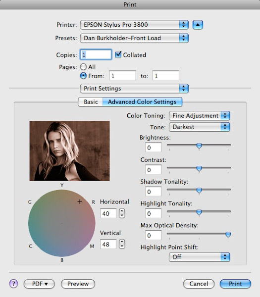
This next screen shows the ‘Advanced Color Settings’ tab in ‘Print Settings’. Here is where a colour tint can be applied to the printed image, by moving the crosshair in the coloured disc bottom left, or by entering numbers in the adjacent boxes (Horizontal & Vertical co-ordinates). I’ve included this here as I used these settings in my first tests. The hue (40, 48) is that recommended by DB in his method and I’m sure it is beneficial if you are using a UV light source. I found that for creating a negative that would be printed on conventional silver-gelatin paper, especially on variable contrast paper, the colour actually gets in the way. So I leave this setting at the default, 0, 0 for printing now. The hue chosen is reflected in the thumbnail image, which is a fixed image that bears no relation to the actual photograph being printed – a pity.
The selected item in the ‘Color Toning’ drop-down automatically changes to ‘Fine Adjustment’ when the hue is changed.
It is important that the ‘Tone’ option is set to ‘Darkest’. We want the printer to lay down as much ink as possible. All the other settings are left at the defaults, zero, and ‘Highlight Point Shift’ is ‘Off’.
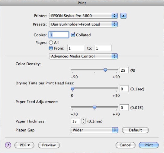
Moving on to the ‘Advanced Media Control’ box, the settings here are based on DB’s method and show the Colour Density set at +25% to increase the colour hue applied. It can be left at this value even if you are not adding colour to the black & white print.
Drying Time and Paper Feed Adjustment may be left at the default values as the method here uses the front load feature on the Epson 3800. For transparent media, the front load avoids the ‘pizza wheel’ marks that can occur if the film is fed through the normal paper path. These appear as a line of equally spaced clear dots on the printed negative and are casued by the guide wheels used when paper is transported via the top load or rear feed slots. My first experiments used the normal top load – and I got pizza wheel marks. When using front load, the film has to be fixed to a card support as the feed mechanism is designed for thick media, 1.5 to 2mm thick, which is then transported horizontally into the printer without using the ‘pizza wheel’ guides. The print area is somewhat reduced using front load, but the absence of pinhole tracks is worth it! I taped my sheet of Pictorico film, print side up, to a piece of mountboard, being careful to ensure that the tape was pressed down well so as not to foul the feed mechanism. Because of this front load requirement, the Paper Thickness needs to be set at ’15’ (1.5mm) and the Platen Gap set to ‘Wider’ in this dialogue box.
It’s worth going back to check all the settings in each dialogue box to make sure nothing has been missed. If you are happy that all is okay, save the settings as a preset, press the ‘Print’ button once you’ve loaded the film, on its support, into the front load slot of the Epson 3800.
Here are examples of the digital negatives Made using both the DB method and my own (based on the MW method). With the first (right) using the DB approach, you can clearly see the reddish hue resulting from applying a colour in the ‘Advanced Color Settings’ tab. Whilst this is a good negative, well suited to block UV light, the contrast control curve used did not suit my needs. To be fair, the curve is intended for use with Inkpress film and I was using Pictorico, so this may have made a difference. I found that the separation in the mid-tones was less than desired.

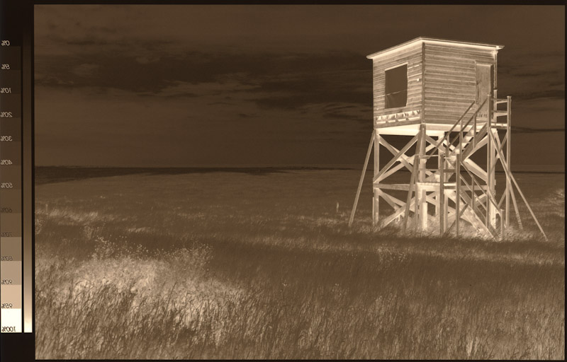
In this scan of a negative (left) made based on the MW/RR method, modified to suit my workflow and printing requirements, you can see that the reddish hue is absent (no colour applied) and that the overall tonality, although similar, offers greater mid-tone separation. This negative prints well on silver-gelatin paper.
Note that both of these are shown with the printed surface uppermost, hence they appear reversed left to right. This is the reason that we print using the ‘Flip Horizontal’ setting so that when the printed surface is laid in contact with the photographic paper for making the contact print, the orientation is correct.