Negative Feedback
The first thing you discover is that you can’t just take a digital image, convert it to black and white, reverse it (tonally, using the ‘Invert’ function in Photoshop) and you’re done. You can print a negative from it for sure, but it will not print onto photographic paper well. Inkjet inks are designed to produce good results on paper, viewed by reflected light. In order to get the kind of densities needed to block transmitted light, some adjustment of the image is required before reversal ready for printing.
In addition, depending on the type of paper or process that you intend to use the negative with, some contrast adjustment will be needed. I intended to print on conventional silver-based enlarging paper, with subsequent lith processing, so that needed to be taken into account. Had the intention been to print with platinum or palladium then a different contrast curve would be needed to allow for the different tonal range possible with those papers.
So what do the experts say about how you should go about this translation from digital image to analogue print? But wait a minute, is the end result really an analogue print? This is debatable. The granular image of a conventional negative is truly ‘stochastic’; random in the extreme. The dot pattern laid down by an ink jet printer is dictated by the digital information it receives from the computer and is ‘dithered’ according to predetermined algorithms (stochastic screening) to give the illusion of continuous tone using single droplets of ink of differing sizes, with a certain maximum number per inch (up to 2880 dots per inch on modern printers).
So a digital negative from an ink-jet printer is exactly that, and the print that you obtain from it by conventional analogue methods is only an copy of that digital image. It’s a bit like cutting a vinyl album from a CD original.
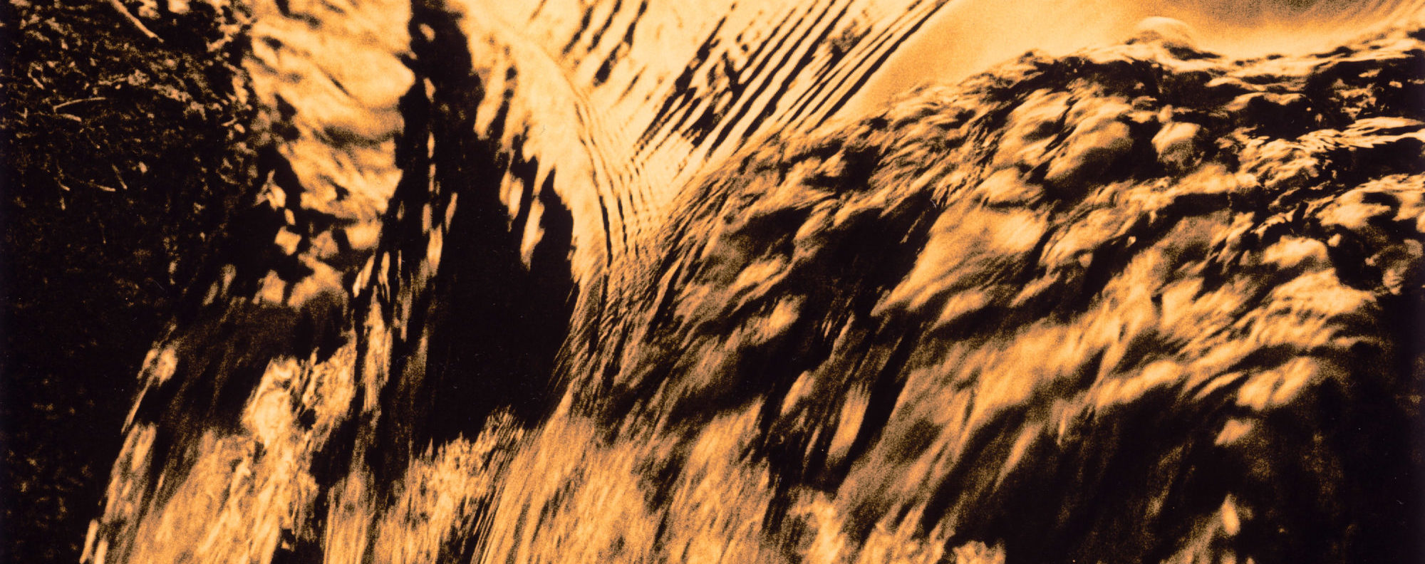
The type of paper surface you print on can effect the look considerably. A glossy photographic paper will reveal a lot of the original digital negative’s structure if examined closely. A platinum print on rough watercolour paper will conceal a lot of the fine detail that may be transferred from the negative. Some people print their digital negatives on to translucent white – rather than transparent clear – film, as the diffusion of light through the white backing when contact printing helps to diffuse the fine dot structure of the image. For those familiar with conventional photographic enlarging, this is much the same as the way a diffusion enlarger head behaves as opposed to a condenser model.
The three methods examined, Dan Burkholder’s, Ron Reeder’s and Mike Ware’s (hereafter referred to as DB, RR and MW), yield very similar results. Both have their own techniques for determining the appropriate contrast control applied for different destination printing methods. DB makes available his sample curves for silver and platinum printing as part of the purchased package and also adds colour to his final negative image via the printer settings (see later).
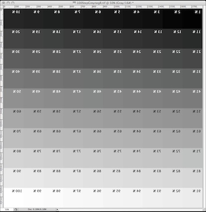
MW prefers to work just with Levels in Photoshop, and considers Curves to be ‘a snare and delusion’ for novice digital negative workers. His approach is much more empirical. He uses a step tablet (shown) from which you print a negative with printer settings you might use for a typical digital negative – you’ll have an idea what those are later in this article. You then make a traditional contact print with this negative, using your chosen process, and assess the results when the print is dry. Using this ‘real-world’ print, you can work out the Standard Printing Exposure (SPE) to achieve maximum black and then determine whether the highlights are printing correctly. If they’re not, then printer settings are adjusted to lay down more, or less ink until the full range of tones in the negative are capable of being printed.
The percentage densities printed on the step tablet are reversed because the printer lays down ink onto the film surface that is then laid in contact with paper. In the final print the numbers appear the correct way round!
In the method described here, a simplified step wedge is included as a reference, both for the negative creation stages and the subsequent printing.